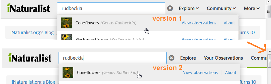
New Header
We're testing out a new version of the header! Click the buttons at the bottom of the page to try out Version 1 or Version 2 and let us know what you think. We wanted to improve a couple things:
- Search in the header
- Support smaller window sizes
- More focus on observations and taxa
If you want to provide feedback, please
- try and live with a new version for a few days before letting us know what you think
- explain why you like or dislike something, e.g. "I used to be able to do X but now I have to do Y and Z to do that"
- specify which version of the header you're talking about
- tell us what browser you're using
- don't just tell us which version you like; if that's all you have to say, just continue using the version you prefer and we'll be able to see that
Also, you can search with keyboard shortcuts. / opens the search field, and you can navigate the autocomplete results with the arrow keys. Hitting ENTER will take you to observations of that result, and hitting CTRL+ENTER or CMD+ENTER will take you to the detail page for that result.


Comentários
I like Version 2. I love the additon of the +Observation button to the header. I'll continue testing but that was my first reaction.
The very first thing I did was click on the "+" in "+Observations" to see how the menu would expand (e.g. like in older versions of windows explorer). I'm sure I'm not the only one who will have that reaction.
Second vote for V2. I really like the new design, especially the "Community" and "Species" tabs!
My initial testing was to show the changes to someone (my boyfriend) who has not used the site, to see which version was the most intuitive. He immediately ruled out version 1 because it was too compact; he wouldn't be able to find things quickly. I agree. Even though I've been using this site for some time, the way version 1 is laid out just doesn't make much sense and would cause me some problems if I was trying to find something. After comparing version 2 with the original, my boyfriend ultimately liked version 2 better. He liked the addition of the '+Observations' and 'Your Observations' tabs. He also preferred the reorganization of the rest of the tabs because it was more compact. I liked the addition of the '+Observations' tab, but I'm not sure how I feel about the reorganization of the tabs. I feel like the 'Species' and 'Community' should switch places, since (to me) the 'Species' tab is more important. Also, the 'Help' option should have its own tab, instead of being hidden under the species tab, and all the tabs should be centered instead of to the left. Now there's just a big empty gap. The keyboard shortcuts are pretty cool and very useful.
These are just my initial thoughts. I'll be using version 2 for a few days to see how it works long term.
I vote version 2. :)
I can't find "Identify" in Version 2 (and that's where I spend a lot of my time!)
Its "Species" and then "Needs ID"... that is the Identify page in V2. I'm loving Version 2 - very accessible!
I like version 2, it's faster to work
I vote version 2
I prefer Version 1...
"Help Identify" might be better than "Identify" or "Needs ID." The latter are not intuitive for someone totally new to iNat.
Great to have "Help" in the header. Why is it separated with a divider?
In Version 1, the text for "More" links to Places. It probably shouldn't link to anything.
Should the "Species" menu item in Version 2 say "More" instead or something? Why would "Needs ID," "Places", or "Help" be categorized underneath "Species"?
On mobile, if I have a menu item open, I have to click out of the menu in order to open a new menu. e.g.: (Version 1) click Explore, then have to click somewhere else on the page, then click on Community in order to see the contents of Community.
Maybe you could link to /journal in the Community section?
Does anyone use /taxa?
Accessing Search: It's cool that "
/" opens the search in Chrome, though that doesn't work for Firefox. I wish that just hovering over the magnifying glass would open up the search box, or perhaps that it remembered to keep the search box open, similar to how it remembers which things I like to see and which I like to collapse on the individual observation pages. If I'm viewing on my computer, which I almost always am if I'm performing a search, I would never want the search bar to be collapsed.Middle-clicking on the name of any search result does not allow me to open in a new tab. I can open in a new tab by clicking "View observations" for people, places, and projects, but not for taxa. Same result in Chrome or Firefox.
Inactive taxa are appearing in the search results. Try Erica longifolia.
My settings, which display scientific name first, aren't picked up.
Should clicking on the text for a Project name in the search results go to the project page rather than a list of the observations in that project? Ambivalent on whether clicking a username should go to their profile or their observations.
Before, I would hover over species in header, search for species, and it would bring me to https://www.inaturalist.org/taxa/search?q=species+name. If no results, I would at least get a page that said "No results found" with the option to search for it in external name providers. Should a search external name providers option be provided? Or some sort of "no results" error message or information on how to find what you're looking for? (e.g. a flag for curation). Now I have to go to /taxa and use that separate search field.
The default icons for users and taxa without photos should probably be circular and square respectively. The results can be visually confusing, trying to distinguish between user and taxon. Maybe names should not be displayed in parentheses like scientific names, but rather "bouteloua - cassi saari" or something else to help distinguish them visually. Try "careyana" to get a good idea.
Default project icon should be more intuitive (not a leaf, to better distinguish from plant taxa).
Looks like there's fuzzy search for users, places, and projects. Awesome. Taxa soon too? :)
How are search items ordered for people, places, and projects? For example, "City Nature Challenge" shows 5 different places associated with CNC Duluth, then the 2017 project page for Santa Teresa. "City Nature Challenge 2018" still shows the 2017 Santa Teresa project page first.
For search strings with a ton of results, City Nature Challenge as an example, an "All Results" page would be mighty nice.
I vote 100% for version 2. More practical, especially -Needs ID-
I guess either of the three are fine with me. I prefer having the +observations button there. Just not that big of a change for me to be too excited either way. But I agree with Cassi that the categorization of links doesn't really make sense.
What would help me more is to have a fully responsive design so that there isn't ever any need to scroll left/right when the window is resized. I hate having to scroll left/right. I think a lot of folks work with two windows open, and even the new designs require left/right scrolling with two windows open on my typical wide-screen monitor. Also, I'd prefer, in Observation mode, that width of images stay the same when the window is resized and reduce number of images per row instead. It's currently 4 per row regardless of window size. Like how it works in Identify mode. But in Identify mode, the image width is smaller than in Observation mode. I'd prefer wider images in Identify mode.
I prefer version 2 over version 1.
My partner didn't know there was a search option either because of how it is hidden.
I agree with cassi... I like version 1 better, i don't feel strongly about it though. I also agree that the ID help page seemed less explicit and kind of buried. We want that one to be prominent!
Version 2 is better than V1, but I really miss the rollover to drop the menus down without clicking. The "Needs ID" seems less obvious/oddly specific to me compared to "Identify" since Identify is broader (some folks go through and ID things other than observations that are still "Needs ID"). It's also a little weirder to find search now.
I think Version 2 is easier to navigate. I really like the layout and the way things have been categorized! I agree, however, that Help needs its own place. When someone needs help, they don't want to go on a scavenger hunt for it. :D
I find V2 easier to navigate and I love the +obs button but kind of expected a drop down because of the "+"... The help section needs to be pulled out of species--if you want to keep it in a menu then community seems like the best one for it,but better still have it out on its own. Last thing you want when you need help it having to look for it. Great improvement overall, well done!!
Both versions are aesthetically pleasing. As mentioned before, I think the organization of the tabs are much better in Version 1 than Ver. 2. I'm surprised so many users seem to prefer the latter, but I guess that has something to do we with how different users use the site. I one thing I do like about Ver 2 is the presence of a "Species" tab, but not everything underneath it really makes sense with that header. At the same time, I don't think having a miscellaneous "More" tab is ever really helpful either.
Additionally, it feels a lot more cumbersome to simply search for a species, place, or observation by hiding search bars behind all these little navigational tabs that were completely unnecessary before hand. I think that's my biggest gripe with it, and one that should certainly be addressed in the final version. I think there's a problem when long-time users cannot readily find the search function of iNat, let alone newcomers.
I don't know why button shortcuts are necessary for the search bar. Why not just have it present by default?
I prefer v. 2, but (1) please pull the "help" out as a separate tab. (2) I don't understand why "places" is under "species." (3) I agree with all those who want the search function up front. Thanks.
I don't like Version 1. If I am looking at someone else's observation, or even one of my own, I am not going to be seized by a sudden desire to add observations.
I like Version 2 better, even though it is "busier."
As someone who spends a lot of time trying to identify other people's observations, I do not like either of these options. The big green Observations button is MY observations, which I can already get to below. And on the left, in Version 2. Is Identify under Species / Needs ID? That's weird.
That being said, I am giving Version 1 a try to see whether I can get used to it.
I like version 2, but I miss being able to toggle quickly to the “places”, “people”, and “guides” pages.
I think Version 2 is awesome! It definitely looks nicer than Version 1.
Perhaps Version 1 and Version 2 both should be available to people, and they can change from either version in the "Account" settings?
I really like both versions! They have a nice, sleek look. Very nice. I’m sure that whichever one is chosen to update the site, we’ll all get used to after some practice.
Although, I do think that “Identify” should have it’s own tab by itself, as it’s where I spend most of my time as well.
I strongly agree with @bobby23 @janetwright and @bouteloua that it is undesirable to hide the search box in both versions.
The new search is by far the most useful feature of these new headers, but having a collapsing search box really detracts from the usefulness of having a header redesign at all.
I and a very large portion of others would probably use the search features more than any other single element on the entire header. I very strongly request that the search box be permanently visible, with a blinking cursor in it (at least on the front page), as is the case in many other websites containing a large troves of content.
Examples:
https://ebird.org/map/
https://www.itis.gov/
https://en.wikipedia.org
https://www.google.com/
I much prefer version 1. This would only be a slight preference if, in version 2, the species drop-down were changed. I am using Google Chrome.
Version 1: This layout seems quite logical and is very good for supporting smaller window sizes. Maybe this is too concise for people? It does, perhaps, seem a little odd having all that space up there when we are used to it being filled. I guess it's possible that it might be more difficult for new users to find their way around.
Version 2: I really don't like the "Needs ID" replacing "Identify" and I find it odd that Places is in there. It was so odd, in fact, that when I first looked at it, I read the drop-down first, thought it was a "more" or "misc." tab and was completely confused by the "Facts and Stats" button. I agree with @bouteloua on this one in that Help Identify could be a good replacement for Identify/Needs ID if it is to be replaced. By the way, I find it a little odd that both clicking on the species tab and clicking on "facts and stats" goes to the same page. That could just be me.
Both: I really like the +Observations icon. I think it will ultimately speed things up a little. I also really like the new search functionality.
CMD+click doesn't open in new tab for any of the drop-down tabs, which could be very frustrating. I really miss the project drop-down that shows the projects I frequently use. I use it fairly regularly to go to my Euphorbia species of the US project and having to search for it or go to a new page to select will slow me down. Could they possibly be listed to the right when hovering over the project subtab?
Good point @sambiology! I spend a lot of time in identify too and it would be great to have it as a separate tab.
Vanilla) First, yay, there's now a direct link to Flags! This also seems to have been rolled out around the same time, so I might as well give a yay for that. Maybe there would be an easy way for the Updates section to be further filtered (i.e. Followed Users, Subscribed Taxa, Flags, etc.). But that's not the header.
Ver. 1) I immediately dislike this version due to trying to file everything under so few tabs. I also dislike the removal of added search functions as I frequently use both the Observations and Taxa (Species pages). This last page also isn't strictly a species page. The More tab really feels unnecessary as there's a ton of extra space on the header based on the minimum width of the page, and most of the links can be filed elsewhere. The search bar is a bit ambiguous in this form. With this set-up, I think it would be useful to have an added filter for Observations, Species, Users, etc. I do like the + Observations button, though there's now a redundant space on the main page as + Add Observations. I think Needs ID is decently logical, but I'd also agree that Help Identify would be more intuitive for newer users.
Ver. 2) I like this one better as there's a bit more accessibility, but I think it also has its problems. It took a while to realize that the old Observations button was moved to Explore, and I don't think this is quite intuitive. Personally, I think it would be logical to have both Observations and Places added under the Explore tab (partially given the tagline of the Places page being "Find a new place to explore"). I have the same comment on the search bar as in Version 1 due to the loss of several search bars from vanilla and the same comments on the + Observations button. One new comment is that clicking the search bar now stretches the header - maybe fixed width would prevent this. Facts and Stats seems to be a bit of an illogical name to me as well; if we're moving away from using the term Taxa (which would be more accurate), maybe something like Organisms? Help also seems more logical to file under Community than Species as well. Another comment is that Your Observations also appears under the user tab so seems a bit redundant (and could be re-distributed to a fixed-width search bar).
Other) I think one thing to consider is that iNat users often fall under one of a few categories, at least at a given time: observer, identifier, and explorer. A lot of accessibility was removed for identifiers. Maybe an Advanced Search (same-window "pop-up" or new page link) would help preserve that?
Specs) Comments are based on Google Chrome, ver. 67.0.3377.1, as viewed on macOS 10.13.3, High Sierra.
prefer version 2
However, I would prefer If you would devellop the places tab and make it one of the header tabs, next to species instead of being a submenu of it.
It would be nice if you could select a certain geograpic area and find out what has been observed in that area.
Mixed feelings. It's certainly good to have quicker access to Add Observations and I like that, although it's not a link I would use often in that form (I use the photo_upload link).
Version 2 is much better from my standpoint, although I find the Species menu a muddled mix of things and for that reason would probably not use it.
Do you know how much people visit the different pages offered in these menus? I think the People and Projects pages are not particularly useful except as places to launch a search for these things - so why can't the header search (for Species right now) also include People and Projects among the matches?
I don't like the way that entering search text and hitting enter (without scrolling down - I am a keyboard person) does nothing - shouldn't it at least open a page of search results (which would make it easier if the exact match is not in the first 10)? I'm still not a big fan of search boxes that only open when you find and click on the magnifying glass. It always makes me have to scan around longer to find how to perform a search.
For myself, I would probably only really use the Your Observations and the Search button on this header. My own entry points into iNat are on my Chrome toolbar. These are the things I use regularly: 1) Photo Import (http://www.inaturalist.org/observations/import#photo_import), 2) My Observations, 3) various prefiltered Identify searches (Australian Lepidoptera, global Pterophoridae, etc.), 4) My Profile, 5) Calendar, and 6) Species search. I follow people I encounter as I navigate these pages rather than going to the People page.
So far I prefer version 2:
I like the species sub-menu; "Guides" are now "Field Guides"?
I like having "explore" and "my observations" as separate menu points
I liked the more "direct" access to my projects (was 1 click, now 2-3) in the old version
I prefer version 2.
Easier access to the options.
Version 1 is too minimalist.
I now wished I didn't reply to this topic... I receive notifications everytime someone replies to this topic.. How can I switch this off without receiving my other notifications?
Overall version 2 seems the best. One problem I have with all versions is the way the notifications work. If I have multiple notifications i.e. the speech bubble icon turns red and has a number next to it higher than 1 and I click on it, it immediately resets to a black icon with no number next to it. The way I would it to work: the icon turns green instead of red and shows the number of notifications. When I click the icon it should expand but not reset anything. When I click on one of the notifications the number should decrease by one and not reset as if I have viewed all notifications.
Obviously the notifications are important to me me. It seems that people find different things are important to them, so maybe the answer is to allow individual customisation of the header.
One other thing I would change is the '+obsertions' button should be a verb i.e. '+observe' or even leave the + sign out.
I agree with @andrewgillespie about making the add obs button a verb (I actually like "Add observations" better than "+ observe." The "+" isn't intuitive to me and apparently not to others as well
@wouterteunissen Go to the home page and click the gear to the right of "subscriptions" (right side of the page). When there, click on "posts" to the left. Go to "New Header, by kueda" and click unsubscribe.
I agree with @janetwright that "Add Observations" would be the most intuitive, especially for newcomers.
Either version is okay with me, I like that they look cleaner. The only change I do not enjoy is having to click through to get to a specific project. On the old version I could just hover over projects on the header and my list would drop down. Now I hover over "community", click on "projects", then select my project from the list. While not a huge deal, I appreciated the more direct route to my projects.
@nathantaylor7583 Ah that's great! Thanks I didn't even know it existed! Nice to have! I keep following this thread, but without getting all the notifications! thanks very much!
I switched to #2, and then immediately forgot that it was something new, which I suppose is a vote in its favor.
@cthawley, the menus open on rollover for me. What browser are you in?
@dhobern The header search does include people, projects, and places in the search results. Try "bouteloua" or "chicago" then "chicago, IL"
For folks voting for a version it would probably be helpful to Ken-ichi to know what you mean by it being faster, accessible, more practical, or easier since the versions aren't very different. Is it having the top level header items of "Your Observations" and "Species" that makes it faster, because you use those links very frequently? Getting to all observations and Identify is nearly the same in both versions. Once Places and Help are pulled out from being incorrectly categorized underneath Species in Version 2, little space will have actually been saved with the redesign, especially with the search bar open.
Both versions: I like how "(+) Observations" disappears when I make my browser window smaller. I also often use a split screen. With the search bar open, the header is partially hidden on my screen for Version 2. Version 1 works great for split screen. I almost commented on how the add observations button would be better as "[verb] observations," but in languages other than English, that could take up a ton of room on the header.
Having projects be a submenu seems like it could be annoying to navigate (menu collapsing itself w/ small cursor movements), but I do click on those in the old header...
With the notification drop-down narrower, almost all notifications are now wrapping around to a 2nd line. Harder to read and ends up taking up more space than before. They also aren't left-aligned correctly due to differing icon sizes (not a new problem).
@bouteloua The menus don't open on rollover in Chrome
@tigerbb, that's so weird, they open on rollover in both Chrome and Firefox for me, both header versions (Windows 7). Would be really frustrating to me if they didn't open on rollover...
@bouteloua I find v2 faster because previously it took 2 clicks to get to see my observations and to add observations and now it is one click for each. If 'needs id' was top level as well then all the things I use most would be one click. The rollover works for me, but the notifications would be nice to have rollover too. I am using MacOX 10.11.4 and Safari 9.1.
I will keep testing, but here is my initial feedback. I much prefer V1 to V2.
V1 is more compact, but more importantly, the layout of the menus make sense to me.
With V2, Explore isn't a menu, it's a button. What does "Explore" mean? Explore places? Explore observations? Explore taxa? As it turns out, it take you to Observations. So why not just call the button Observations? Also, the Species menu makes no sense to me. Clicking on Facts and Stats, takes you to the Species page. Needs ID, Field Guides and Places have nothing to do with species, so why are they under the Species menu? I very much believe that the names in the menus should more or less match the page it takes you to. And it's confusing and a little irritating when the same word is used to mean different things in different places.
The best thing about both V1 and V2 is the new +Observations button. Definitely a great addition!
To be honest, I prefer the existing (old) header best. All it needs is to add the new +Observations button to it. With the existing header, the Observations and Species menus have "Search obs..." and "Search taxa..." search boxes right in the menu. I use those all the time! With the new search box, once you type into it, you have a choice between "View observations" and "About". Why not just call them "Observations" and "Taxa"? Also, the "About" link is middle/right clickable, but "View observations" link is not! Please, please, please make sure that all links are middle/right clickable. I often want to pop open a link in a new tab or window, without leaving the current page. Thank you!
Version 1 and version 2 are about the same. The only comment I have for version 2 is the Facts and Stats tab which didn't seem to have any stats. Version 2 does seem more condensed, and I did like how large the tabs were in version 1.
I like the version 2 menus way better than version 1. I do think the plus sign for the new observation button might need to be something else. I showed a few new users or low use users and they didn't get right away that it was for adding observations.
Tried both versions and both are an improvement. I think Version 2 gets to my most common tasks better and it just feels more natural.
One thing that seems to be missing from both versions is the rollover pull down to your most recently used Projects. Checking in on Projects is how I keep up with most activity that is not my own.
Version 2 is better. The drop down menu titles are good and as it has a "Your Observations" button.
@bouteloua That IS weird! I'm using Chrome in Windows 10. I wouldn't have thought it made it a difference, but apparently it does. No rollover drop down.
Preferred version 2, because upper menu is more deployed, which requires fewer clicks.
Positive:
+ Observations is everywhere, and it's super
faster
Help is in upper memu, this is a plus
it is finally easy to find People, including curators (but it is still difficult to find which taxa they curate))
Three comments:
1) it seems to me that there are two main types of users in iNat - observers and experts. Very convenient for observers - "My observations" locate in upper menu. Experts deserve the same, those, who only identify, but do not place their observations. They are also worthy by one click to get to the item "Needs ID", and not double-click - at first on "Species", and then on "Needs ID". I would like to see these menu item "Needs ID" next to "My observations" in the upper menu.
2) A very important page from the old search "Search-Species" was lost, where the search was just text, and was not associated with iNat taxa databases, which required a mandatory selection of a taxon from the list. This old search made it possible to enter the text name of the taxon without reference to the base of iNat taxa, press Enter and in the case of absence of a taxon make it possible to perform search in two partner bases - Catalog of Life and Encyclopedia of Life and pull up the missing taxa from there. Now I did not find this possibility. For example, this can be checked for the missing taxon "capsodes robustus", I would have come to this page earlier, but now for any search nothing happens.
3) The "Species" menu. "Needs ID" refers in principle to observations, not to species. The name "Facts and Stats" does not reflect anything. It turned out that you choose the "Species" in the top menu, then the incomprehensible "Facts and Stats" and again you get into the "Species", where, maybe, there are Facts, but there is no Stats.
And the last, I would place the top menu like this: Loupe, Explore, Your observations, Needs ID, Species, Community.
Browser Chrome, Windows 10, everything works fine.
@bouteloua I'm using Chrome in Windows 10. Rollover doesn't do anything.
I also vote for version 2, if a change is really needed ;-)
With Firefox 59 on Manjaro Linux all seems to be fine.
Stefano
Folks, to re-iterate what Cassi said, detailed descriptions are what we're after here. You don't need to just say "I vote for version 1" because we can tell who has chosen which one. What we can't tell is why you like one or dislike another. Many thanks to those of you who have provided that context. If you don't have more input beyond which one you prefer, just continue using the version you like.
Since some of you have reported 404 errors, please tell us which URL shows you that error. When I click on the "Dashboard" link in the dropdown when I hover over my profile pic I get to https://www.inaturalist.org/home without a problem using Chrome on a Mac.
For those feeling overwhelmed by updates from this post, you can unsubscribe at https://www.inaturalist.org/subscriptions?type=post. Believe me, I feel your pain... except it's my job to feel this pain.
Okay. I like V2 because its easier to navigate for me. The "Community" tab has "People" and "Projects", which I very much like, and the "Species" tab has all the species information. I'd like to see "Places" as a separate tab, and as others have noted, "Help" should be another tab, so it can be easily found. I think Version 1 tries to fit too much into too little.
I'm using Chrome on Windows 7.
I also spend most time on 'identify' which is intuitive to find on Version 1, but on Version 2 I'll have to get used to clicking 'Needs ID' instead. Overall I'm more drawn to Version 1's compact layout (ie. I can find things faster from the menus), while Version 2's layout feels a bit unwieldy (ie. I need to explore the menus a bit more, some have drop-downs and some don't which doesn't feel right). I use Chrome on a Mac.
Version 1 is more compact and intuitive to me. The dropdown menus are well organized for the tasks that I usually access.
Victor 2 all the way
Good. But definitely needs an ID button right there next to the +observations button.
unsubscribing from this topic didn't work... got another 20 notifications...
I really miss the ability to just quickly do a species search. With V2, I now have to go to the species page before actually searching.
I like the original version better than both of the other versions, because it is a lot more spread out.
I prefer version 1. Version 2 downplays the importance of people for a start. I like the Add Observations button from V2 thats all.
Version 2 menus feel more intuitive, and I like that it's less compact.
Leave it as is, don't change to either version 1 or 2.
@wouterteunissen, It could be because you commented again. Try it again after commenting or without commenting and see if that works. It probably automatically resubscribes you when you comment.
After using V1 and V2 for several days, I like the original version better. Its easier to navigate, and I can get to everything much quicker. I'm using Windows 7 and Chrome.
A lot of people are missing the search area. Click the magnifying glass which is right next to the logo and the search opens. The search results include taxa (incl. species), people, places, and projects, as far as I can tell.
I like the add observations not the rest.
On a desktop in the middle is more logical.
Why not change the header depending on the screen size.
Firefox keyboard folks:
CTRL+/should bring up the header search. Seems more reasonable than trying to override default Firefox behavior.Windows Chrome folks: I just tested this in Chrome on Windows 10 and the rollovers worked just fine, so I feel like we're missing something. Are you perhaps using Windows devices with touch screens?
@nutcracker hit explore and then type in your species or are you looking for a more advanced options???
I’m on a iPad Pro no issues yet
Also am using sometimes a windows laptop
Honestly I can get used to navigating either one, and I am happy with the "original" one too. I only use iNat on a desktop, Win7 with Firefox, so may be missing things that would be more obvious improvements in the phone app. The keyboard shortcuts are definitely a big plus.
Hopefully you are coming at this from the question, "what do people want to do most often when they visit iNaturalist?" I imagine you must have some pretty solid statistics on that by now. I can only answer for myself -- most of my iNat activity is adding and curating my own observations, and IDing the observations of others, in roughly equal proportions. Working with a few projects is third.
Whatever the collective answer is to that question, I think those activities should occupy the prime, single-click/tap positions in the header, with everything else dropping down from those, or from a small number of additional tabs, intuitively organized by topics. That said, if there is particularly underutilized iNat functionality that you feel needs to be promoted more, I suppose that is fair game too.
Sorry for the generalized feedback. Like I say, the details are less important to me, so long as I know where to find the functionality I use, and the workflows stay smooth and intuitive.
I like version 2 better. I don't like how in version 1 you must find everything in a drop down menu (on left side).
@nutcracker can you give an example of something you searched that wouldn't come up?
I like version 2; so far, the "Your Observations" header link has expedited navigating to (and editing of) recent observations (curating conservation commission monitoring data).
~ Using Mozilla Firefox ~
I prefer version 1. Options under each of the three header items are all useful and well-grouped. Much neater overall.
In version 2, "Your Observations" and "Explore" tabs take up a lot of header real estate without much utility; I rarely use either. I much prefer to go to "Needs ID" (now "Identify" under "Explore" in version 1). There I get a page of thirty observations to ID, rather than a scrolling list of four and a bit, and a large, unneeded map to the left.
I use Firefox on a Mac and spend most of my time on IDs rather than making observations. I'll live with and get used to whatever the larger community prefers. There have been several changes in the two years since I joined and most have been positive improvements - can't think of any former feature I miss. Onward and upward, Ken-ichi and crew.
Version 2 for me. I'll be leaving it on.
Nothing wrong with '+ Observations', it's pretty clear I think.
'Your Observations' would be better called 'My Observations' & maybe moved under the 'Community' tab as I doubt many people go there that often.
'Needs ID' would be a good top-level tab. That would encourage people to chime in with answers.
I really dislike v.2 in that when I click on 'Your Observations', the time to load the map takes awhile and frankly, I know where I am getting most of my observations. I much prefer the list view for quickly going back to something that I observed. I do like the addition of the +observations to quickly add a new observation.
I like V2 . The organisation of menu is more logical and I like the fact that My observation is on the top level menu and is one click away.
Places, however, should be put on the top level menu and not under species
I also like V2 -- I think it is streamlined and easy to use.
I prefer V2 over V1 or the original version.
The main reason I prefer the new versions is because they have the "Your Observations" link. I use this filter regularly to curate my own observations and because it takes quite a few steps to get to in the older version, I have to have the link bookmarked (if I could also save my favourite identifying filters somewhere on the website then I would barely need to bookmark anything now). I don't care if it's "My Observations" or "Your Observations" or whether it's in a main menu or submenu but I love that it exists now.
The organization of the submenus makes more sense in V1 but I like V2 better just because there are more links accessible.
As others have mentioned, I think "Explore" in V2 should be renamed to something like "All Observations" or "Observations" and "Needs ID" should be something with "Identify" in the label.
I think Needs ID/Identify should be in the main menu.
I don't really mind having to click the magnifying glass to get the search but I can see why it might be annoying if I used it a lot more.
Edit: Another thing, I'm not sure why, but I like the old notification list way better than the new one. Something about the text size or colour in the new version makes the notifications all blend together into an unattractive wall of text in my mind.
I'm using Chrome and Windows 7, and I have to click on a menu item to open the submenus. Hovering doesn't work. I have a touchscreen laptop but I'm not using the touchscreen function on iNat so I'm not sure why that would affect it...
@perkpenn I also don't like the map view but I found that it will remember any format I use. I.e. the first time it takes me to map view, I change it to grid view, go to the home page, click back on "Your Observations" and now it is on grid view right away.
@upupa-epops Thanks for the input. I will go back and use V2 more and see how that works.
I like the Explore button in both new versions 1 & 2. A similar function defaulting to the current location of the user is available in the mobile app (world icon) but I felt it was lacking in the web version. From a brief comparison Version 2 seems to have more functionality but perhaps I need to try them out more.
Both versions need a species search box like the current version. (Unless I'm missing it...)
@daniel112, the magnifying glass icon to the right of "iNaturalist" on the header opens the search box.
@stevejones Hmmm. It doesn't take me to a list of species like it does currently (it defaults to an observation list and goes to the taxon page when clicking "About"). Is there any way to get to the species list page with the thumbnails (screenshot link below)?
https://i.imgur.com/wFX4rqD.jpg
If I had to pick I would say version 2. I think the "species" tab is a better format than most items being nested under "explore" like they are in version 1. That being said I think the "your observations" tab should be nested under explore like it is in version 1. If you kept almost everything in version 2 the same but nested "your observations under "explore" like it is in version 1 I think it would be better. on a side note I wouldn't mind the search bar to be already opened. I don't mind that it is collapsible but there is plenty of empty space in the header. I don't know why the default is to have the search bar collapsed. Also I think it would be better if you put the search bar tab (the magnifying glass) on the right hand side of the other tabs and had the bar open up to the right of it. That way when the search bar is collapsed or extended it doesn't change the location of any of the other tabs.
It's not clear that the 2nd and 3rd options are Projects.
After giving it a day to sink in, I really prefer the classic header. Two reasons:
Search boxes will show on hover in old header. I cannot emphasize enough how disruptive to the work flow it is to have to click or press a key to preform a search now.
Projects drop down. Critical to getting to a project quickly with fewer clicks. I believe hiding them will not good for creating a more collaborative community.
If I could get to the search box without a click, I would prefer Version 1 of the new headers. I especially don't like Version 2 because I don't believe "Your Observations" needs to have its own space on the header.
Both designs are awesome. They look modern and efficient. I prefer version 1 because it's faster and easier to work.
Awesome design!
I like version 2. Add-observations box in both versions is good.
I like version 2. Good job!
A few updates in response to bugs you folks have found
1) Rollovers should work for those of you with touchscreen laptops. If they don't, please email us at help@inaturalist.org and tell us what browser and device you're using.
2) Fuzzy taxa search. Searches like "calif newt" should match "California Newt"
3) Middle click should open result in a new tab. Firefox and Safari don't seem to want to open the tab in the background, though. Still thinking about it, but not sure there's a great solution there. Browsers are understandably pretty cagey about opening new windows.
4) Place matches should get a higher ranking than before (no one complained about this but it was bugging me)
Thanks again for all the thoughtful feedback. We're still digesting it all, but we'll try and synthesize and maybe make a version 3 next week.
One of the pages I visit the most is the journal page listing everyone's journal posts. It seems like it deserves a place in the community tab.
https://www.inaturalist.org/journal/
When I click on Facts and Stats, I was expecting to get this page:
https://www.inaturalist.org/stats/
Not sure that page justifies a spot in that location, but the Facts and Stats title could be improved in any case.
How do you "batch edit" in version 2?
Changed my mind. Version 2 is better. I do wonder how to get back to identifications that I have previously made. Sometimes I need to find names to use in my own list. I use Vivaldi for a web browser.
Hi guys,
I like the new Version (Version 1). It is less cluttery looking overall, and the categories make sense to me. Also, when you have a Place onscreen, there is less confusion between the Place tabs and the header when showing people (i.e., teachers, students, etc.) how to navigate all the good info.
But of course, I will still have to get used to it! No more fixed action pattern for a little while.....
Liz
Overall, the Version 1 header is best for two reasons:
*it is cleaner looking.
*it doesn't look like any of the tools that it's heading (e.g., projects, places, observations, people, etc.)
These are good reasons because it means new users are more likely to remain oriented as they move through the site. I remember starting out and really not understanding the difference btw. a Place people list and a Project people list.....the site is a rabbit-hole of similar options that can discombobulate a person
I agree 100% with Liz (@evanmant)
same, version 2 looks more easy.
I think Version 2 is faster and easier.....
It has all features organized and udpated correctly, so it's efficient to work for me.
I like version 2 better.
Things I like:
Fuzzy search for everything being available from any page
Having "your observations" go to https://www.inaturalist.org/observations?user_id=reuvenm instead of https://www.inaturalist.org/observations/reuvenm
Version 1 somewhat hide the parts of the site that don't really work that well (places and guides)
Things I don't:
Menu options should make it clear what they're pointing to - as other have noted above some of the menus and choices in Version 2 don't really make sense
Having to click to search: why not have the search bar always available, at least if the window size is wide enough
Losing the ability to get to my projects in one click
I still think the "+" in "+ observations" isn't clear and makes it appear as if you can expand a menu.
The search results could be improved. If I search "ontario", the second and third results are plants that don't have Ontario in the common or latin name. Turns out these species have alternate common names with Ontario in them, but a) The search term that is being matched should be visible in the search result and b) These shouldn't be showing up ahead of species that do have Ontario in the common or latin name that I see when using the site
I can't Ctrl+Click from the search options which is very frustrating
I've just noticed that the search doesn't give consistent results. While testing out the fuzzy search I noticed that "ostrih fer" would find Ostrich Fern, but now I'm trying again and it doesn't. There's a lot of weird behaviour with the fuzzy search - right now it find Ostrich Fern with "ostrih fe", but not "ostrih fer" or "ostrih fern"
And I just want to add how amazing the iNat team is for soliciting feedback and responding to it!
You could make either version stick to the top of the screen when scrolling. The EN/FR language options at the top for Canada are considerate.
I hate them both. I can't figure out how to select all and edit or add to a project as a group. What am I missing here.
Lots of great comments already, so I'll be brief: I liked Version 1, mostly because two separate large links for just /observations and /observations? seems like overkill. Unlike most folks who've posted so far, I found the more compact organization much more intuitive. But hey, that's why you poll your users when you're designing an interface! I'm certainly not mortally offended by version 2.
Version 2, definitely. Love the Your Observations, much easier to find and use.
Still testing v1, but I can't figure out how to get to batch editing either. (@annikaml Did you figure it out?)
You couldn't get directly to batch editing in the old header either, so I'm not entirely sure what you're referring to. If you're talking about https://www.inaturalist.org/observations/kimberlietx, hover over your icon in the upper right and choose "Your observations"
kueda why mess with something that works. For example, I wanted to add all of the species I posted at La Selva, Costa Rica into their project. I searched and got all the observations, but could not do anything more. In the past, you could batch edit a group, but there is no way to get to that point in this new version. If you make it harder to participate, then people will not participate.
I often upload and forget to add to particular projects or include observation fields, so I do that through batch editing. In the "old" version I would go to Observations>By You (in the header) and click on the Batch Edit button. In the new versions, the layout has changed so the batch edit button is missing. I can access it the way you mentioned, through the link under my icon, so that works for me!
On a side note, I never liked the layout on that screen (Observations>By You) EXCEPT when I was batch editing. Most of the time I like to see my observations in the same layout as the search results, as is now happening in both the new v1 and v2.
Can we have a forum on this site?
So, I've played with the two versions for a few days now, and I'd have to say that I prefer version 1.
I'm using Chrome on the PC, but I also use an iPad.
Version 1 seems to be a little easier for me to navigate as I've gotten used to the locations of the "needs ID." I think it (and the other version) are both sleek and improvements over the original header.
Truth be told, I don't have super strong feelings or adversity to one over the other - whichever one is chosen, I do think I could get used to (as a lot of the others would as well).
As for the batch editing, I can still upload loads at one time and 'batch edit' them as I am uploading. As for adding loads at one time into a project, I've never been aware on how to do this in bulk. I'll do that one at a time, but in all honesty, most of the projects are taxon and place-based, and I can gather all of that information through the filters on the observation screen.
Overall, I think both headers are good improvements, especially for new folks. Looking forward to seeing which is chosen or which hybrid is created! Whatever it is, I'll get used to it. :)
I am having an hard time understandin. It almost sems like you are trying to copy Alan Ginsberg's poem "Howl". A disgrace like Bob Dylan and Bernie Sanders.
Love how you can now add observations from any place, as it is in the header (version 2). What I didn't like about version 2, compared to older version is the my observations. In old version, you would go to a list of the ob's, from which it as simple to search.
But the new version takes me to a globe map. Two problems, my ob's are always in NZ (so far), and NZ is always behind something. But more importantly it is memory hungry. Being a bit behind the times with my IT, the map function is memory hungry and slows things down. So I avoid it unless I am needing some geographical info, that is best found this way.
So would prefer the older style of ob's being available as a list, only without a world map.
I like version 2 for the most part, although I don't like that "your observations" in the header takes me to a different place (the map view) than "your observations" in the profile drop-down menu. I use the list view way more often than the map view, so to me, it makes sense to have the map view of my observations grouped under "explore", the way it is in version 1.
@leslie_flint You can still get to the old version of "My Observations" (https://www.inaturalist.org/observations/ "your-username") this way: https://snag.gy/18Ga3Q.jpg
From there you can still batch edit and batch add observations to projects.
@longlivebriefer there is a Google Group: https://groups.google.com/forum/#!forum/inaturalist
@davidwhyte as I said above to parkpenn, the new observations page will remember your preferences. I don't like map view or list view for most uses, but the old observations page always has list view and the new observation page defaults to map view. However, if I change the new one to grid view and leave the page, it will still be in grid view when I come back.
I tried version 2 first and once I got used to it, I liked it. Then I tried version 1 and concluded that I like v2 better. I suspect if I had tried them in reverse order, my perference would have been the first one I tried. Either one is fine with me, although finding a project I've joined takes more clicks. I do not look at the projects listed under my projects (Featured and New, I think they are called). I would prefer to have all of the projects I've joined appear on that first link.
Millie
i take more issue with the Bernie comment :) Though I didn't understand it. Which was maybe the point. (edit: i see it was a spam account that got banned)
The problem with an in-house forum would be trolling, as exemplified by the comments from the banned account mention above.
definitely in terms of trolls, also more broadly and as others have pointed out iNat also uses Google for maps and a bunch of other stuff. I get not wanting to give Google your personal info, I've kinda given up on trying to avoid that myself but Google is not without problems for sure. But it's difficult to see how our debating plant common names or ID reputation systems is going to make much difference in terms of global megacorporation hegemony. I'd love to have an in-house forum but it gets tricky... the fact that the spam/troll bots are asking for it makes it less appealing!
I'm still learning to use the site so the most I've done is submit observations and gingerly try identification of others' observations. As a novice, I vote for version 2 because of the inclusion of the "add observations" and "your observations" links.
First impressions:
--The fonts in header 2 are too small to read. Too compact and hard on the eyes.
--Also, I think it's useful having the user name appear in text as in Version 1. If you share a computer with someone or have multiple accounts, it can be hard to tell if you're in the right account with just an image.
--Why put Needs ID and Places inside the Species menu in Header 2? Needs ID is about Observations, not Species. And Places are about geography, not species.
And then I just tried going to my pet project. With V 1, that is 1 click from the center of the header. After the Projects menu drops down, I can go directly to the project of my choice in just 1 click. In V 2 I have to drop down the community menu to get to projects, then wait for an entire page to load, then find my project on the project page, then click again to get to the project I want. UGH! Please, let me keep V1!!!!!
Kinda annoying to continually see inactive and/or useless projects in the search ("X Taxa of Y Place" sans any members or community). I almost always want to search for taxa, so perhaps that should be the default search.
It also seems like search result priority should be given to results that match 100% what was entered. I agree that it's very confusing when the result is matching something in a different common or scientific name than what is displayed in the dropdown.
search: boutelo (en route to bouteloua)
results:
great mullein (Verbascum thapsus) --bad; fuzzy matching French common name "bouillon blanc"
gramas (Bouteloua) --good
gonzalezi (Miguel Gonzalez Botello) --bad; fuzzy matching surname, given priority over Bouteloua spp.
common bottlenose dolphin (Tursiops truncatus) --bad; fuzzy match
bouteloua (cassi saari) --good
saffron finch (Sicalis flaveola) --bad; fuzzy matching French common name "sicale bouton-d'or"
side oats grama (Bouteloua curtipendula) --good; should be higher up in list though
crimson bottlebrush (Callistemon citrinus) --bad; fuzzy
2 Bouteloua spp. at bottom of list
Why does user bouteloua appear 2nd on the list for search "bouteloua" but user nutcracker appears last on the list for search "nutcracker"?
Much diminished results when searching for scientific names via the quick route of "first 3 letters of genus-space-first 3 letters of epithet."
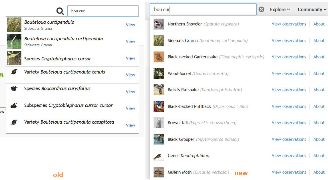
Cannot find genus Taenidia?
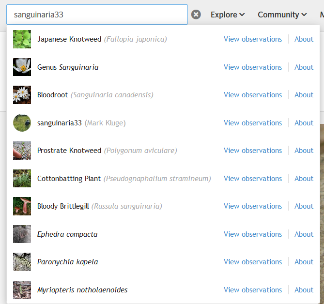
Bizarre that the user sanguinaria33 is not returned first here:
While it would be slightly clunky to have a dropdown tab to select whether you're searching for taxa, users, projects, or places, it would alleviate some of my issues with the search results to default to the existing taxa search style.
Another annoying search example I just found: typing "fisher" yields a bunch of random taxa, but the animal called just Fisher is not one of them.
Now that I have spent time adding observations I found the original best. The 'Your Observation' link going to the page with the big map in the background was such an inconvenience that the '+observations' didn't make up for it. On the old 'By me' page there is in any case a nice blue button at the top to add new observations.
edit: it might just be the way I work though. I add something and then often do a bunch of other things and then go back to my observations to add things I either forgot or can't be added at the time of submission. I would click on 'Your Observations' in the menu which takes me to the page with the map even if I last used the list view. The map in the background is difficult on my MacBook Air. I usually use the 2 finger slide to scroll pages. If the curser is over the map then the 2 finger slide zooms the map and it is annoying because I now have to carefully place the curser at the edge of the windows to get the hidden scrollbar. (MacOS 10.13.3, Safari 11.0.3). On my iMac I use a magic mouse and the 2 finger scroll which has the same issue.
@andrewgillespie has made a comment I saw higher up in this discussion and ignored. Doesn't "Your Observations" go to whichever view you used last? Whenever I click on it, it takes me to the Grid view - not the Map view. Or is there something else I have done to set that as my default?
I'm a fan of version 2. My first suggestion would apply to whichever header you go with, have it be stationary while scrolling through the feed or whatever is on the page.
For folks reporting un-searchable things, it's very helpful to know that "cedar" and "fisher" aren't returning what you want, but I also need to know what it is you're trying to find. For "fisher" I assume it's https://www.inaturalist.org/taxa/41799-Martes-pennanti but "cedar" is pretty ambiguous.
lol
I like the new green +Observations feature to quickly add new observations. With both versions, I don’t see how to “batch edit” observations to add several to the same project.
Version 1: I like the new “Explore” feature, with “Species” showing many different species and the opportunity to research a particular species with “Find Species.”
Version 2: I used to use the “Species” drop down list to research a particular species, and don’t see how to do that.
When I was using the Project Curator Tool to “find suitable observations,” it didn’t stay on Version 1, and would flip to Version 2, which makes it hard for me to comment on that.
With both versions, I like the grid option for viewing my observations, and also for viewing all my observations by order, eg. “Butterflies and Moths,” or genus, so I can see how many different species I’ve seen. One strange thing I noticed with the grid is that at least one observation doesn’t appear: https://www.inaturalist.org/observations/10445314
I don't have an opinion yet on the headers, but I would like two other things. One, sending a message seems to be pretty buried. Have to open the in Inbox, then find the New Message button. It could be up a level or two.
Secondly, at least when using Safari, the Observation Fields options are invisible so I don't know what all the choices are, and don't usually remember the language to match. My project fields show when I click there.
I do think 1 is a much cleaner look, and I like the add Observation button in the headers.
"Your Observations" should probably default to verifiable=any. Right now it excludes casual grade observations, @wendy5, which is why your casual grade Muscovy duck observation did not appear in the list of results.
And one more thing while someone is making upgrades. Sometimes when I select a place (Safari) it refuses to load it, and then I have to post without a location and go back in and edit. Not so bad, but when that happens, it loses the ID and and comment as well, so it all needs to be re entered. This happens frequently.
this post seems to be attracting some strange spammers (or one strange spammer).
I suggest the poster with the nasty language be banned . . . Feed that language into google. Or not, and just get rid of him.
i already banned them
need admins to ban the troll IP
The name says it all... LMAO ! ! ! !
This is something you see in security blogs I’m on not a nature one
Way to much time on there hands
Only tried version 1 so far and I don't like that I have to make more clicks (not less) to get to Species, Projects, etc. from the Home page. I think new versions should make things easier and faster, not more cumbersome.
Version 2 is better than version 1, but the search box should be visible without an extra click please.
While you are at it, could you please make some way there my observations are sortable based on taxonomy? For example, when I search for Lepidoptera for my own observations, I get 661 hits, but I would like to be able to sort these (in list and grid view both) based on both date of observation, country/place, AND Taxonomic groupings. The latter will help a lot with ID and just finding observations of the same or similar taxonomic groups. The only way I seem to be able to get taxonomic sorting is in lists or projects, not within my own observations. It would be so helpful, especially when you know you have seen a species before but can't remember its name, or try to sort out the ID of species within a smaller group. Thanks!
Re: Search box and results. I really like the new "/" access to the search field. However, with either Version 1 or 2, the only navigation I seem to be able to do is with up and down arrows through the dropdown choices. Each choice is accompanied by "View Observations | About" which seems to imply that I could choose to see observations (of a taxon or a person) OR go to that species or person's page. But I actually can't select either of those choices, the result being that I'm always thrown to the observations page. It would be nice if those were separate clickable (or arrowable) destinations rather than having to Control-Enter for them. (Using Safari 11.1 (11605.1.33.1.3) with Mac OS 10.11.6)
Interesting. I do not see a big difference between version 1 and 2.
I continue to test.
thanks
I like the addition of the +observation button to V1 and V2.
I'm leaning towards preferring Version 2, however, the main functions I use are easier to access in the old version than in either of the new ones.
The thing I do most often is access the projects I administer. I used to be able to see a list of them in a drop down menu from the header and neither V1 nor V2 has preserved this function. This adds more clicks to get to where I'm going.
Another thing I do often is to look up the distribution of observations of specific species and this was another task you could do straight from the old header in the search field but not in V1 or V2.
(Using Chrome on a Mac)
I generally prefer the current header. Of the new headers, I prefer version 1. I'm checking things in both Chrome (on a Mac and in Windows) and Firefox (Mac).
In version 2, the organization seems odd. Why are "Places" and "Needs ID" under "Species"? Why "Explore" instead of "Observations"? It's not a big deal, it doesn't take long to figure out how things are organized, but it's counterintuitive to me.
With both, I think the new search box has some good and bad features. I like that it accommodates misspellings (e.g., "Larrea tridentata" is the first entry that comes up if I type in "Larera tridentata") and I like the keyboard shortcut that goes to the search box. I don't like search boxes where I have to wait for a database look-up. Sometimes it's nice and fast and, although it still has that little extra step of selecting from the list rather than just hitting enter, it's just fine. Sometimes it's slow. Sometimes the look-up hangs and the entry I'm looking for never pops up, so I have to re-enter text into the field. Sometimes the entry I'm looking for is lower down in the list and a differently-spelled entry is higher, throwing me off if I do a quick down-arrow + enter (e.g., if I enter "Valeriana", the top one in the list is "Subfamily Valerianoideae" and "Genus Valeriana" is the second one down). In a quick check this morning using the new headers, it looks like it's behaving reasonably well... about half the time it's pulling up the right entry at the top of the list by the time I'm done typing or within a second. About 2/5 of the time it's taking 2-3 seconds. About 1/10 of the time it's taking 4-10 seconds. Some days, when adding identifications, it seems like half the look-ups take 4-10 seconds and I get a bunch of hangs. In any case, I don't like staring at search boxes waiting for lists to show up and much prefer being able to just type text and hit enter. It would be nice if the search box (on the header and, really, everywhere else!) would interpret "enter" as "use the entry that is spelled exactly the same as the text in the box", which the old header search boxes did nicely.
Chrome.
V1 (preferred)
Like - 3 headers are visually clean and easy to navigate
Dislike - I wish headers were centered as most of iNat happens in the center of the screen so looking to the left feels a little weird.
The one thing that I wish could get a little attention is being able to break out comments vs identifications in the status dropdown. I'm more concerned about missing a comment from someone then a new ID. This is especially the case when I do a bunch of IDs. ..maybe there is a trick to this I don't know?
i dont like either. I prefer the current one.
if they do need to be reduced for some reason (i.e. smaller screens or to match the cell phone app), then can it not be done incrementally?:
iNaturalist Observations Species Projects Places Guides People Help Add-Observations mail comments Your_Spot
iNaturalist Observations Species Tools People Help Add-Observations mail comments Your_Spot
iNaturalist Observations Species Community Help Add-Observations mail comments Your_Spot
iNaturalist Observations Species Community Help mail comments Your_Spot
iNaturalist Observations Species Community Help Your_Spot
iNaturalist Observations Species Help Your_Spot
But the abbreviated ones are too many clicks. If there is space please display them all!
The hidden search box is difficult to intuit: even when you know it is there it is easy to overlook. Also it does not work properly: it only works for observations and species, but not for places and projects or guides. Or rather not intuitively for them - only half heartedly (always observations as option one, but not observations within a Place, but a place for observations: not intuitive).
Initially it was very slow, but it got faster the more I used it.
"+ Observations" does not work for me: I clicked the + expecting something to open, not the "Add an Observation wizard" rather simply "Add Observations" (or even "Add" will work) ....
I like the option of "Add Observations" in my Dropdown menu: I want it there even if the "+ observations" is present because under my name is all the stuff I do most regularly. (the current "import and calender" I dont use from there ever, but Add is where I expect this.)
I like "Your Observations" rather than "Observations", but it must be followed by Add Observations.
The trio of Your, Add and Calender are a unit and can have a divider before the next set of items.
Version 1:
why is Community: People and Projects versus More: Places and Guides? Not logical. People are community, but Projects are more "Tools" or "Summaries" like Places and Guides. I need to double think which to select.
Cool that the search copes with species and people, but it is not obvious for projects/places/guides, and for e.g. places opens the observations filter with place, not the place filter. Not intuitive. Presumably it only works for dropdown menu one ("explore"): would be nice to have search menus for places, projects and guides in this line too.
The option of "Observations" vs "About" is nice, but would be better if about was "Species Page" for species, "Profile" for people (and "Project/Place/Guide" for the other options).
Help under More is nice.
Version 2:
is even more weird. it is not logical.
Explore is just observations, but there is also a heading for Your observations? Why?: you can get that from umpteen menus in V1 and current. it is just unnecessary. Use one's drop-down, or select under observations, it is not an important enough option to warrant space on the main menu.
Community is again people and projects - I dont get the link or the grouping.
But I do not like Species on the end: it is too important to be an afterthought! But the dropdown gives some unexpected things - what is "facts and stats"? - I have to click this to work it out = About = Taxon page. The order must be About, ID, Places, Guides - the current order is not ergonomic.
I like Help, but it does not belong here under Species.
What I dont like about V1 and V2 most, is that I cannot access "MY" from them at present (esp. Places, Projects, Guides) (but then not possible from the menu for last two). (what about a third option in the new search box? - Observations/About/Yours)
In summary, I much prefer the current header. But i like the addition of "Help". The "Add Observation' is over the top - it is on the dashboard, on my dropdown menu and several other places (except where one might expect it under the 'Observations' tab - as a dropdown option).
I suspect part of my dislike for V1 and V2 is that they remind me of iSpot, and many wasteful clicks to get to where one wants to be on some non-intuitive secondary menu. The current iNaturalist division of Observation data, Species data, Tools: Projects, Places & Guides, (but missing Help: having to go to bottom of page is a pain), with the current dropdown menus (but missing "your" (or should it be "mine") on Places and Guides) is a design that was appealing and intuitive. Please dont change it unless you have to.
(chrome or firefox, on PC - Windows 7 or 10 - no obvious differences)
I think either version will work fine, and both will aid newcomers in navigating the site. I like version 1 better, especially the "Explore" tab. I think the "More" tab could be dissolved.
The old version is fine, so don't change it unless you really have to. Neither makes iNat better.
I have now used V1 for a week. What I miss most is being able to right-click on Species and start with a Kingdom or Phylum. This was especially aggravating to me when in Identify mode, since there was no way to search without abandoning the observation I was trying to identify.
I do like Help at the top of the page versus having to scroll to the bottom.
Chrome on Windows.
I will now give V2 a test drive.
To get back on topic, I prefer version 2 more than version 1. The only thing that could be improved upon in my opinion, is a faster way to get to a species page. With the classic header you can search a species and get to its species page, but I haven't yet found an easy way to get to that (Unless there's something I'm missing, which is usually the case).
@cliygh-and-mia , click the magnifying glass to the right of the logo, type in the species name, and click "About"
@bouteloua Thank you, works fine and looks nice. Thanks again for the help!
I prefer version 1 actually.
I like the Explore tab better in 1 than in 2. specifically, I like the ability to select "Observations" in addition to "My Observations".
I used both versions for a few days each, with both Safari on Mac and Chrome on Windows.
I don't see any way to batch edit under this system. Help
@leslie_flint I think you have to go to your dashboard (drop down menu next to your profile picture, top right) and then choose "observations" to get to the batch edit.
You can also go click on "Observations" in the set of tabs on the home page: https://snag.gy/18Ga3Q.jpg
I like version 2. It seems the best compromise between compact/simple design and overview and quick access to the most important functions.
I like version 2 also. Simpler and allows iNaturalist to function on smaller screen sizes.
Another vote for version 2.
+1 for version 2.0
I tried it for a few days. I think I prefer version 1, but I think some of that is due to familiarity.
Re: search in version 2
I would prefer if clicking the text on a species text in the search results brought you to the "About" (taxon) page, rather than the observations.
A. I see above that Cassi said the same happens with project results; it brings up observations rather than about.
I wish it had a way to bring you to a search results page. That way, after you selected and viewed one result, you could return to the results page to select another without having to re-enter your query into the search bar. I also miss being able to filter species search results by color and kingdom.
@kueda Just a thought, but I was wondering if iNat should start "verifying" users. I've just been noticing more trolls/scammers, and I thought it would be a good idea.
Also, Version 2 has my vote, except that there should be a more obvious way towards Identify.
My vote is for version 2. I've been using it for so long now that I don't like the original. :-)
Rather than "Facts and Stats" under the Species tab, I would just use "About", which is consistent with how the search bar now displays the link to the taxon pages. Simple is good.
"Help" doesn't make sense under Species. I would see it working better under Community (as People, Projects, Help, Forum), or sitting out by itself.
Oh, and I agree with some others here that it's a confusing for the "Your observations" banner link to go to a different page to the link of the same name under the username dropdown. I find the older "your observations" page vastly more useful because of all its batch functions.
If they must coexist on the site, it would be better to give the links different names. However, perhaps there are plans to revamp "your observations" and merge the functionality of the two current versions. That would be best.
Both represent significant improvements over current version. Slight preference for v2 here.
I prefer version 2, because I get to where I want to be the fastest.
Thank you for all the work you've done, Ken-ichi :-) I'm not too fussed about which header is implemented or not, and I think all permutations, issues etc. have been fully covered in the comments above. I would just ask that the header is fixed (or 'floating' depending on one's preferred terminology) so that I don't have to scroll to the top of the page or hit Home every single time I've come to the end of whatever page I'm on.
Further thoughts on search boxes, continuing from my post a week ago:
Perhaps it would make sense to have a terminal character that would change the behavior of search boxes throughout iNaturalist to a "verbatim mode", e.g., if the character used were ".", then searching for "Larrea tridentata." would take you straight to the page for the taxon named "Larrea tridentata", while searching for "Larrea tridentata" would give you the list of various clickable options as it does now.
The other possibility that occurs to me is to have some checkbox hiding in one's user settings, that would turn on a verbatim mode across the board in iNaturalist.
In any case, although I certainly recognize that the list of clickable options has advantages in many contexts, I would very much like to have the option to skip it, both in the header and elsewhere. When you don't need to do a database look-up because you know what entry you want and how to spell it, this just adds more complexity to the process and sometimes creates a substantial delay.
I prefer having my observations as a top level item though perhaps the add observation could be combined with it in some way?
Love the "needs ID" in version 2.
either one, just stick with it
After using it for a few weeks, I think I could live version 2 and prefer it to version 1. A few things now require more clicks via the header through subsequent menu pages, like getting to active projects (instead of the hover-and-click that was possible with the old header). Another thing I preferred in the old header was being able to reach the list page for my own observations (https://www.inaturalist.org/observations/[user]) instead of the map that's linked in the new header.
@dendroica I followed the link to my observations, clicked list view, then closed it. Now when I follow the link to my observations they come up as a list.
@srall Ah, thanks!
So, it looks like I've been using version 2 for over a week. Of the two new options, I prefer version 1. I never use "Explore" or "Your Observations" in the header of version 2. "Projects" is more awkward in version two than in the currently-used header (can't just pick one), and soon its utility may be even less. The two things I use most are both under "Species," namely, "Needs ID" and "Help." The organization of categories in version 2 seems more illogical than in version 1.
I've been using ver 2 for awhile and feel it's a solid improvement.
Here's a suggestion, though it's rather trivial. If the user could opt to leave the search box open, that would be nice. Unlike many, I use iNat on desktop machines because I don't post observations while I'm in the field, preferring to study them a bit first. On a desktop there's plenty of room to leave the search box open. I use search a lot, and so I'd rather not need to open it every time I use it.
Generally iNat is an outstanding resource. Two other thing that I often wish for is this, though these are probably not applicable to the Ver 1 v Ver 2 question.
(1) I'd like a way to publish an observation as a private note to myself -- ideally it would also be possible to 'un-private' it later. It would be useful when I had a bad photo that nevertheless documented a date and locale for my purposes.
(2) I'd like a way to include speculations that would be hidden from the general public. I could see them, experts could see (and search them), and I could share them to individuals on their request. When I included speculations in the past, I was criticized for it because others might rely on them; point taken. On the other hand, sometimes it's better to dare to wrong.
I prefer V2. It was easier to find my own list of observations. I just found V1 more difficult to navigate, but I'll keep experimenting with them.
As an aside, I find it difficult to get to the Google discussion forums. I know it's controversial, but I'd love a more direct way to access conversations in the community. Bugguide has its own forum, and I think something similar would be great. Sometimes, I just have questions that I think others could answer, (for instance, do I harm an organism too much if I remove it from water temporarily for a photo). I know people could address some questions easily enough, but there's no real place to ask them, and I hate targeting people through directly messaging them.
Slight preference for Version 2, although I miss the ability to jump directly to most-used projects from a dropdown. Firefox.
@kueda Have you noticed that I.... the one who usually goes ballistic over changes on the iNat website... have been silent since your initial post?
As the country song sung by Conway Twitty says" I've been around enough to know". Great song: https://www.youtube.com/watch?v=-XTTLM56oxg Shows how old I am!
I realize that no matter what changes are made to iNat... If I want to continue using the website, I will have to adapt.
Onward and forward!
Can I "like" Linda Jo's comment? :) I used to be a web-interface designer and tester, so I certainly have strong opinions; but I agree that both versions will do.
Version 2 is excellent! Good job!
Thanks for the new version, actually I don't like because I can't join in a project throught web, I can only follow and for example I am administrator of a project and I can´t see the users and members of project
version 2...
I much prefer version 1. Neater.
Ok folks, we've introduced two new versions for you to test, versions 3 and 4. Some things that are common to both:
Hitting ENTER inside the search field will choose the first result, or it will just try to search observations with a taxon named whatever you entered
More responsive to window size (in different ways)
Identify as a top-level item, at least for medium to large windows
Recently joined projects like the old header
Bigger magnifying glass (since many people seemed to miss search)
Replace "+ Observations" with "Upload" and an up-arrow icon
Link to /observations/:login is now "Edit Observations" under the user menu on the right
What's different?
Version 3
Search stays open after you open it
Identify and Your Observations go in the Explore dropdown for small window sizes
Version 4
Search on the right
Upload button stays visible for all window sizes
Menu items all go under the More dropdown for small window sizes
So again, vote with your feet and use the one you like best. If you'd like to leave a comment, please let us know why you like one or the other. There's no need to just tell us which one you like b/c we can see that in our data.
For those tired of updates from this post, you can unsubscribe using the link below the comment form or at https://www.inaturalist.org/subscriptions?type=post
I like the search box staying open in 3. The "enter for first result" is definitely an improvement for me. It still does funny things on occasion... e.g., the first result for "Valeriana" is still "Valerianoideae" rather than "Valeriana". Other than that and it being (unsurprisingly) a bit hit or miss on a really slow internet connection (I've got two computers in front of me; one on a nice fast wired connection, one on crappy wifi), it seems to be working well on a few dozen test searches. I'll try it on one of those days when it seems like look-ups from the search field take forever (and it isn't just the bad wifi) and see how it reacts in that context.
I like 4 best of all so far. It is very easy and clean to find the things I want to find. One extremely minor issue: when I click on "My Observations", the little green line that shows it's selected shows up both under that and under "Explore" . The other choices don't do that.
Someone mentioned being able to keep the header at the top even when I scroll down, such as when I'm commenting here. That would be awesome, if it were possible.
Didn't like version 2. What I want to do is: get to my observations, and look at what needs an ID. Both are just impossible to find with this header.
Version 3 and 4 make that slightly easier, but still not good.
Here are my top 3 things:
my observations, this list, not the map view: observations/berend
identify
look at people I follow
First 2 are fixed with header 3 and 4, but how do I get to people I follow?
@berend I think in all 4 versions (and the current) to get to the specific list (edit my observations) that you linked to you have to go to the drop down menu at your avatar in the top left. Likewise to see the people you follow you'd go to "Profile" on the same drop down menu. Or "Dashboard" would give you the most recent posts from the people you follow. Another way to get to a list of your observations, but not the one for bulk editing, you can use the new "My Observations" link and then click list view (and next time it should come up as a list). But I had nothing to do with developing the versions.
I think some people were conflating "old header" with "version 1" so I don't really know what some people's opinions above were. "Old version" or something should probably be in the dropdown for testing purposes.
1920x1080 screen resolution, Firefox, I mostly tested Version 3
I switched back to the old header because it's too frustrating that the search does not provide a complete list of search results. There will always be cases when items don't show up in the first few search results visible in a small dropdown. Since a perfect list of search results is not possible ("City Nature Challenge" as the example I used before), an "all results" page for a website's main search bar is 100% necessary and I hope the old header is not inactivated until this is possible.
Search for "Genusname notaspeciesoninatyet" [hit enter] goes to observation search (8.6 million results) but should go to species search ("Looks like it needs to be added to the database").
I agree with @aspidoscelis that searching for the exact text should show the exact text results first rather than trying to show me fuzzy results first, example:
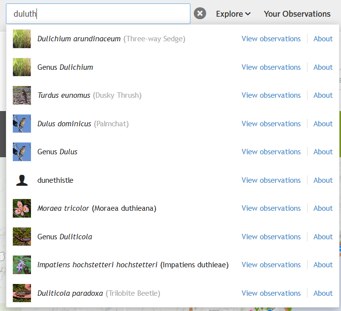
The link to "Your Observations" makes sense to have near the link to all observations, not sure why it would be separated and it takes up a lot of space. I almost never click "Identify" since I have bookmarked my filtered identify searches, so for me it also doesn't make sense to take up extra header space as a top level item.
In Version 4, nothing collapses when I make my laptop browser window smaller. I like how they collapse in Version 3.
The "More" text still links to Places.
calacademy logo in footer should prob wrap around for smaller screens otherwise some of the header space savings aren't realized.
The issue with clicking between menu items on mobile, inactive taxa showing up in search results, and scientific name not showing up first looks like they were fixed. Also great to have recent projects there. Thank you!
My footprint vote will be for old header since I'll be switching back again, but:
-would prefer that search bar can be set to stay open
-whether search is on left or right side, doesn't matter to me
-don't care if upload button is visible on small screen size, it's fine that it gets collapsed into the right side menu like it does on Version 3
thank you!
To reiterate, if you have problems with search, it really helps to know what your query is, what you're seeing, and what you're expecting. The search results have already been updated (and IMO improved) several times over the course of this trial, so searches for things like "city nature challenge 2018" are a lot better than they were originally and I seem to be able to find every CNC project with city-specific text like "city nature challenge chica". Not sure what you were hoping to see in a search for "duluth".
To be honest, I think I'm starting to get confused. I cannot remember once I switch out of a version exactly how it differs from another version, but then I'm not a visual learner, so it's probably just a personal issue. I will say I think I like both versions 3 and 4, using Chrome. I'm puzzled about why "Upload" takes the place of "Add observation." I like the bright green indicator as it's hard to miss, but my immediate reaction is, "Upload what?" I'll keep playing with the versions--sooner or later I'll figure out which version offers what precisely, probably right before an entirely different version rolls out :).
I think I prefer version 3, and I second the fact that it seems odd that the Add Observations button has changed into "Upload". I think that Add Observations fits with the site more, as upload is more generic and less eye-catching. It may be easier for newer people to use and understand, but I think it worked well before.
21 days ago:
*"'City Nature Challenge' shows 5 different places associated with CNC Duluth, then the 2017 project page for Santa Teresa.
*'City Nature Challenge 2018' still shows the 2017 Santa Teresa project page first. "
Now:
*Typing "City Nature Challenge" shows 4 different places associated with CNC Duluth, then the 2017 project page for Santa Teresa.
*"City Nature Challenge 2018" now shows Earthwatch Boston City Nature Challenge Event first. https://www.inaturalist.org/projects/earthwatch-boston-city-nature-challenge-2018-event
*Typing "City Nature Challenge" and pressing enter brings me to a list of observations associated with the place for City Nature Challenge Twin Ports 2018 https://www.inaturalist.org/observations?place_id=124794
*City Nature Challenge 2018 umbrella project (https://www.inaturalist.org/projects/city-nature-challenge-2018) is not in the search results for "City Nature Challenge 2018"
A search for City Nature Challenge should bring me to a list of all things associated with that phrasing, most importantly for this situation: a list of projects that contain that name, ideally with the search result weighted by a combination of things like number of members/followers, level of activity, last date of activity.
Typing Duluth should show any place, person, or project with that exact text before it returns "Dulichium."
https://www.inaturalist.org/places/search?utf8=%E2%9C%93&q=duluth&commit=Search
https://www.inaturalist.org/projects/search?utf8=%E2%9C%93&q=duluth&commit=Search
https://www.inaturalist.org/people/search?utf8=%E2%9C%93&q=duluth&commit=Search
I prefer version 3.
I think yall opened up a can of worms when you asked for feedback. Not sure how you'll make sense out of all the opinions. But here are two things that seem necessary.
(1) The links under each drop down menu item need to be relevant to the name of the menu item. That rules out version 2 because the links under the Species drop down aren't what anyone would expect to see there.
(2) I should be able to access all menu items no matter how small the screen. Total responsive design is a must. You may need to use the "hamburger" icon. There should NEVER be any left-right scrolling on any modern website.
As long as these criteria are met, any reasonable person should be satisfied.
I like when the search stays open. However i personally would prefer if the 'view observations' link were much smaller or absent altogether on the search results and it defaulted to the taxa pages. I don't know why anyone would want to go to view observations since the taxa page has way more to look at. But i mostly go for the maps, maybe others use it differently.
@charlie I view observations frequently if I'm looking to see if the variation I'm looking at is common or not, or for instance to see what a plant looks like in bud or fruit or whatever. I also use the map for range a lot. But I can get to both of those through the Taxa page, and I generally get to them through "explore" not search, and I have found it cumbersome in the past to get to the taxa page at all, so I'd be fine with eliminating it from Search, and it takes a lot of space.
Trying V4 now.
I like the positioning of the search tool on the right better -- more prominent, and I use that a lot.
Also "upload" is a better tag, shorter and that's what it does. It's good.
Wow, the header search box really doesn't like Duluth. I just checked out of curiosity and I get a list of 10 items, none of which contain the text "Duluth". Of course, I never would have been bothered by this in normal usage since I have no reason to search for Duluth! :-)
I previously had voted for version 2. I now change that to V-4. I like the search bar placement and the simplicity of the button layout.
I like version 4 better than 2 now. I would like one thing added though. I have a bookmark right now for All Journals but I would love the ability to see that under the Community or More tabs.
hard to tell on an ipad because i have to keep scrolling up and down to check out options. would be nice is i could see and test the options all next to each other, dont change anything on my account though unless its a common comment
I really love version 3!! Kudos for: adding Identify, listing recent projects under Community, adding More, changing +Observations to Upload. I don't feel like I have to look around for anything--it all makes sense and flows beautifully.
I have been using version 2 for a while now and have not Id-ed a single observation. That's because I can't figure out, how to do this? In the old version you had the "identify" option...then you could use the filter option to filter between observations this option is not there anymore:
https://www.inaturalist.org/observations/identify
@wouterteunissen perhaps try using a different version. ;) It's hidden under Species>Needs ID in that version.
Took a quick look at all four versions - liked 3 and 4 the most, probably because they have the most options "out in the open" and not buried under another tab...
I didn't realize the header udpate, with more options of headers! All of them are OK, but Version 1 is now the one that adapts more to me. It's clean, quick and easy to use at ¡Naturalist. It's modern, simple, and it looks very good.................. All features are well-organized and simple to find.
I have been test-driving Version 3, and am having a hard time getting used to it. I like better access to Projects, although that soon may be obsolete. I do like that the search box stays open after use. I do like that some menu items get folded under tabs in that event. But I find it disorienting that there are not only two states of the menu. On a different computer, I thought that Version 3 had been tweaked, but no, what you see depends on the width of the browser window in pixels.
I still do not see the value in having Your Observations in the header if it does not still appear as you scroll down the page. It is only useful if you are not on the dashboard and not in Identify. On the dashboard, Observations is also at the top of the page.
I am OK with Identify and Upload not taking up valuable real estate on the main header. They both show up there in Version 3 if the browser window is wide enough. If I can get to either of those by hover and one click, that's perfectly acceptable to me. Maybe this is the difference between a computer user (like myself) and a smartphone user. OTOH, iNat should probably put the most heavily used functions front and center. Making Upload prominent encourages new user participation.
OK, tested versions 3 and 4 for a longer period of time--I have decided that either probably will work for me. Both take me longer to figure out than the original, but I'm guessing it's because they are new.
I like the uncluttered V1
I like V4. Most of the frequently access functions are just 1 click away
I prefer the header where it is easy to jump from observations to projects or to places since all the buttons are available on each page. How to go back to it? :-)
Vote for version 3, because of prominent search bar and Upload button on the header. These are the functions I use the most.
I think we all appreciate the effort that has gone into designing these headers, and the opportunity for feedback. But like others I am wondering how you can possibly sort out this jumble of comments. Now that people have had a chance to think about what is important to them and express it, do you think it would be useful to take a step back and do a survey to get a more organized response? Like asking people to check which of a list of tabbed functions are ones they most use, use occasionally, and seldom use? That way you'd have a statistical sample, rather than a series of squeaky wheel ideas. I know I responded a couple of times but then changed my mind when I saw what other people had to say. (I have also learned some functions I didn't know existed!) Impressive work, guys.
Versions 3 and 4 both address my issues with versions 1 and 2. With regard to versions 3 and 4, the organization of the dropdown menus in version 3 makes a bit more sense to me, but I don't have a strong preference between the two. The header link directly to the identification page is a real plus.
I agree @janetwright. At the moment, I am confused and a bit overwhelmed by all the comments.
I don't find the way to projects in any version.
@carlacorazza, under Community in all versions.
I love Version 4
I like V 3 and 4
Ding ding ding! We have a winner for me in Version 3 - I very much appreciate the "sticky" search box that stays open across pages until you close it!
Version 3 is an improvement over 1, 2, and 4.
In Version 4, search is harder to find on the right side.
What I am thinking is that I have this huge computer screen, with less than 1/3 of the width taken up with the current "everything a single click away" (option 0), and now I have four options where most of these are hidden in even less width (and to the side instead of the middle), leaving me with tons of unused width and having to hunt and peck-peck-peck to open a screen.
If I want any of my own observations, I go to my name: they are there. or the Dashboard. Or I use the filter. I dont need it on the middle menu bar and still have to click as many times.
I like the current bar with its dropdowns to search, or just click to open. All the new options require more work. I would be happy for an option that saves time and saves clicks, but all the new ones seem to me to be increased effort.
Can we not just have a menu that shows everything, but collapses predictably as the width decreases?
What I would really like to know is what pages users use most, and how many clicks the different menus require to get to these. (although in truth it is only my pages that interest me: I would also like to know what pages I actually visit, rather than those that I seem to visit). Surely that should be informing us?
If you asked me what I would like the menu bar to look like, it would include be the current version (V0), with:
latest visited places dropdown for the Places menu (like in the Projects menu (V0))
Help menu on the far right (just left of the Add an Observation box), with dropdown to googlegroup & videos
a View Flags option on the Species menu
But quite honestly, I vote to keep the current V0. V1 and V2 are not appealing at all. V3 is best, but drop the "your observations" in favour of separating observations and species. I dont like V4: the idea of "species" under "More" is repugnant - Species (and identifications - not giving but getting) are what this site is all about, and it is being sidelined!! Almost half of all users (43%) to iNat start on the Species page, more than four times the number on any other page, and it is the one that is being most hidden in all the versions presented.
I never use the Species page. What do people use it for? If I want to find an individual species page, I am usually on an observation of that species so I just click the label. Otherwise I just search for it. As a result it makes sense to me for it to be less visible.
I use the "Your Observations" link a lot. Maybe it's just because I prefer Grid view over List view, but I don't really like the old
observations/userlist because it has smaller images, it's more cluttered, and it feels more complicated to search through it. Going to all observations and then filtering by username is too many steps.I guess everyone uses the website differently which is what makes this so complicated...
Yeah, I use the individual species pages for looking at the taxonomy, finding photos and observations, observation map and graph of seasonal occurrences, but I meant this page: https://www.inaturalist.org/taxa
I find version 3 is the most intuitive to use for me, as someone who has only used the site for 4 months and I am not a scientist. I would just like one extra thing: a link to stats (https://www.inaturalist.org/stats) under the 'more' menu.
@andrewgillespie - but all these "stats" are available from the observations menu - on the submenu click species, or identifications or observers and you will get not just the top 5, but the top 500.
For /stats (the information on which can be viewed nowhere else), if not a full menu item, at least linked to from somewhere logical like the About page.
@tonyrebelo Maybe I missed something, but as far as I can tell the stats page has high level statistics about the site, like 'number of active users' or 'platform used' and the stats from observations are about specific taxon, places, people etc. The high level stats are not important for most users, but it is interesting, like the chart showing a large increase in the number of users on the site this month.
what i really wish is the stats page went back more than a year to get a wider view of iNat's growth!
I agree the stats page needs to be linked somewhere. it's neat to see it
I prefer header 2 over 1, but I like header 4 even more. I like the "Upload" heading better, because it's more clear to me that it means upload MY observations, as opposed to viewing others' observations. Also love the addition of "Identify." The dropdowns under Community and More also give me quick access to some of the features I use most.
After trying out the various versions for a while, I prefer the original one, before version 1, 2 3 and 4
Of the new headers I like Version 4 most. I'm glad the Recent Projects list is back in Version 4. I also prefer having Identify on its own menu link.
My biggest problem with all these new versions are the lack of a box to search for a species:
If I type "genet" in the new search field, then I don't see anything remotely related to a Genet. Also if I type "genet" and press enter it takes me to observations, but I want to quick and easily go to the species page, or otherwise at least to the species search screen to see all the genets from which I can pick the one I'm looking for. I found the species search box on the original header to be very convenient to use.
Also I don't think "Taxa Info" is a very accessible name for a page. I think most people don't know what a "taxa" is, instead I think something like "Species Info" would be better.
I agree that most people don't know what a taxon is, so I guess it's a question of whether we want the terminology to be accurate or easy to interpret... genets (Genetta) are a genus, for instance, so presumably you don't want to end up at a species information page in this case. Of course, if we want to be picky, it should really be "taxon info".
I'm also noticing now that usage is inconsistent. In the V3 header, you get "taxa info" from the search box at the left, but "species" under "explore", inaturalist.org/taxa says "species" at the top, and the search box at inaturalist.org/taxa says "find species" next to it. Presumably we should at least be consistent. Would "taxonomy" work here? Although "taxon" is an unfamiliar word to many people, "taxonomy" I'm assuming is a generally understood term among iNaturalist users.
I like version 4. Also, could you guys please create a new iNaturalist app icon? The current one feels pretty dated. Thanks!
Version 3, version 2 is second best but i like 3's font more
I prefer version 2, for the better placement of Search and for "+Upload" rather than "+Observation". I've not used the site enough to have a preference between the menu options.
After trying all four versions, I like 4 best. But I miss "batch edit," because I often like to add several observations to the same project.
I have some troubles looking for some of my observations (for instance, one particular species) among the others. Version 4
An idea: why not adding among Annotations also "host" for insects, to indicate, beside the sex and the stage, also the plant (or other kind of host) where the insect was found?
Like @carlacorazza, I wish we could encourage people to list the host plant for insects. It would be possible to list it under "other fields," but people don't think to do that. I put it in the description, for what that's worth.
@carlacorazza, @janetwright
Why not motivate for an interactions module? The majority of people posting a parasite do not know the name of the host.
An interactions module would allow anyone to post a parasite, predator, pollinator (or any interaction), and post the partner in the crime as well (or more, for instance a crab spider on a flower eating a bee and jackalflies in attendance, or ants farming aphids on a plant). That way one does not have to worry that the wrong host was identified, or that one does not know the host, and the interactions module would allow filtering of say all insects interacting with Cork Oaks, or all pollinators of Craneflowers, or even all gall formers on Sweetthorn.
Both the South African and New Zealand community have already created their own different versions of "interactions" fields. Please dont go creating a whole lot more fields (e.g. https://www.inaturalist.org/projects/interactions-s-afr)
Now what has this to do with headings???
Version 3 and 4 are much improved and both excellent. I prefer 4 but they're both good. One small issue - when viewing the "old" observation page for another user, the "your observations" tab is highlighted
Version 2 seems most comfortable.
I prefer the current version!
I still prefer the current version among the options.
May I please have a little "x" on the yellow "Want to test a new version of the header" box, so that I can banish it. It is beginning to bug me.
Version 4 - best header option out of the possibles. I really like the search bar placement on this version (with it being on the right). When using this version, though, I use "identify" more than I use "community", so it would see that the location of those would be flip-flopped so that "Identify" comes first when navigating the header from left to right.
Thank you very much for allowing an avenue for user input!
I agree with previous responders that version 4 is the most usable of the 4 options, and that finding the Batch Edit option needs to be easier and more intuitive in that version. And I also agree that the current version is still quite usable too. I can happily accustom to either one.
Ok, new header is live! We ended up going with a mix between versions 3 and 4, so
Search on the left (search on the right was creating some problems with results flowing off screen)
Search stays open when you open it
Menu items, labels, and collapsing at small window size as they were in v4
Added "View all" option to view all search results, not just the top 10
Once again, thanks for all the input. I realize not everyone got what they wanted (including me), but that's compromise for you. I'm sure there are still some bugs so if you find any, please report them to help@inaturalist.org or the Google Group.
I really like it, even better than the original version. Thank you iNat developers!!
@nutcracker, under More/Taxa Info/Door marked Beware of the Leopard.
Or just click on the magnifying glass at left. Not sure hovering is an option any more.
It's really great, much much better than before. Thanks so much for all the good work!
Is this change now 100% final? If at all possible might the search bar space be a little shorter (it has room for a lot of characters and the results appear below anyway) to make room for a larger font size? Even just a bit larger would help. The letters are impossibly small for anyone with tired eyes. I'm looking at it on a laptop, don't know if that somehow matters. I was hoping to get my mother using the site but she just won't be able to see it, and she only has a slight reading glasses prescription.
@julie_sf, if you click on the "x" to the right of the search bar it will shrink to a small magnifying glass "search" icon. If you then select the icon and open the box, it will stay in its wide configuration until you click on the "x" again. It doesn't increase the font size, but here's hoping it helps your mother!
The font size we're using in the header is actually bigger than the font size in the headers of Facebook and Twitter, so while it might not work for some people, I don't think it's excessively small for most people. You might try setting your browser's preferences to increase the zoom level. In Chrome that's under the "View" menu, or you can set it for all sites in the preferences, under Appearance (might be called something different in other browsers, but I suspect they all have a similar setting).
@nutcracker, you can currently still get to the old taxa search from that Taxa Info page (https://www.inaturalist.org/taxa, upper right corner)
Ken-ichi also added the "Create a new taxon" link and search external name providers queries to the new all search results page, though you have to click the Taxa tab on the top of the page, e.g.
https://www.inaturalist.org/search?q=missing+taxon&source%5B%5D=taxa
Edit to add: also now just hitting the enter button will bring you to that all results page, which is much better than it going to observations (thank you!!). If you arrow down to an item then click enter, it will bring you to its observations.
it would be nice to have a search tab for comments (and IDs). At present it is impossible to find something that one remembers discussed, that is not in the description.
Getting to the projects one has subscribed to is a right real pain!! Can the headings for Manage your Projects (your projects, subscribed projects, etc.) please not be made live, and the option to open all projects (View All) not be put on the top of the projects list - rather than having to scroll down to the bottom?
Also can the 5 listed projects not please be the ones last used to add to, or the last saved (including managing curators and downloading data), rather than the last created. Projects used daily are not showing, whereas ones created weeks ago, or only used once, are on the top of the list.
@julie_sf I found the font size on the small side too, but just hold down Ctrl and click on + and that will increase the font.
@nutcracker - thanks for the suggestion. But that wont work. For instance, I have a key to the subspecies of Osteospermum (when it was Chrysanthemoides) moniiliferum. So I only need filter Osteospermum moniliferum and my observations. That is still 31 observations to hunt through. But I would like to access the 30 odd species and genera that I have added keys for (I now have a project for this).
Your idea for the taxon image photos is cool, but requires quite a lot of new programming. Would it not work for you to fave the observation. Then all we need on the curate-species-photo page, is an option to sort the pictures by number of faves. it wont be perfect, but it should alert you to other very good pictures that might perhaps even be better.
Thanks @annikaml and @kueda Unfortunately increasing size through browser settings increases the size of everything on a page and it's just the header that's a challenge. I say this as a person with just fine eyes, so surely it's an issue for others. This font seems narrower for it's height than say Facebook's font, which makes it look smaller and harder to read whether or not it's technically larger. And again, it's really only the header where the challenge crops up/irks. Maybe something to do with a combination of the particular letters, the use of bold decreasing negative space, lack of icons making actually reading the words more important, and repeatedly needing to use the header and thus read the words - particularly if you're just browsing around the site. Not everyone's a power IDer or Observer who usually clicks on the same few things over and over. :)
@kueda PS I really like everything else! Especially the Upload button with the little icon. As a very minimal user of projects I do like that the few I pay attention to every now and then show up when I mouse over Community, it reminds me to look around more than I otherwise would. Well, everything except the Explore button, but only because my overwhelmed-with-tabs browser takes more seconds to load all observations than my impatient self can handle. Thank you for all the work!!
Julie_sf: If it's just the header that's a challenge, I think there is probably something odd going on with your display or browser settings. For instance, (at least on computers I use--Firefox & Chrome on macOS 10.10 & 10.12, Chrome on Windows 7 or 8 or whatever it is at work) the header font is a bit larger than the font in these comments. I'm interpreting your comments as indicating that the font size in the comments is fine, while the font size in the header is challenging. I don't know what exactly would cause that, but since it's inconsistent with my experience on multiple computers, I think there would probably be something wonky going on with yours.
Adicionar um Comentário